What is data visualization?
Data visualization is by no means a new concept. Defined as a visual representation of abstract data to enhance human cognition; anything from maps, to graphs, even cave drawings, can be classified as a type of data visualization. However, traditional data visualization techniques didn’t become commonplace until around the early 1800s with the invention of Pie Charts and other tools that allowed for simple visualization to be achieved by the wider populace.
But, it is technology that has been the driving catalyst for data visualization in modern times. The age of ‘Big Data’ requires big solutions. Harnessing the volume and velocity of information and turning it into something meaningful is one of the main challenges that result from the modern ‘data-fervor’. Data visualization can help.
Benefits of data visualization
1) Simplifying the complex
The first and most obvious benefit of visualization is its ability to aggregate and simplify the most complex of data sets into easily understandable morsels of information. We all know how hard it can be to make sense of even the simplest of spreadsheets. With data visualization tools, that is no longer necessary.
2) Faster decision-making
With the information presented to users so that they can easily comprehend it, they can also easily action it. By making information visual, you not only make it more appealing to your audience, but you also reduce the time it takes across your organization to turn information into decisions.
This report from Forrester highlights the critical importance of businesses becoming insights-driven. It is a crucial part of being successful and an invaluable attribute for any business. One element of this is being able to leverage your data to improve your organization’s decision-making. Data visualization provides this opportunity.
3) Trends and groupings
Once visualized information trends, correlations, and themes become much easier to identify and understand. Visualization helps to categorize and highlight similarities much more effectively than raw information.
There are many examples of visualization being effective here. From identifying patterns and relationships within data, to spotting outliers more effectively in information, to more complex iterations, like identifying the sentiment within a body of text.
4) Predictive analysis
Visual datasets are much easier to extrapolate and model to make predictions of future trends or used to find insights that would otherwise be obscured by the complexity of the data. This ensures that you can utilize data not only to meet the challenges of today but predict and prepare for those of the future.
5) Interactivity
Visualization in the modern-sense; dashboards, digital graphs, etc, enables real-time manipulation of the data. This can allow users to change variables, experiment with different scenarios and harness the most out of their datasets.
6) Builds a data-driven culture
Organizations struggle to ingrain data-driven principles into their culture. Primarily, this is a result of individuals being unwilling to replace their ‘gut-feeling’ with ‘spreadsheet-sense’. This doesn’t need to be the case and data visualization is the bridge between the two. By reducing spreadsheets and datasets to simple and trustworthy visualizations, organizations can help to foster a data-driven culture.
Examples of visualization tools
Here are a few examples of real-world applications of data visualization to simplify complex datasets into clear and concise insights.
Graphics
Graphics are a pictorial representation of data. From the simplest to the most complex, graphics range the whole spectrum of what data visualization can achieve.
Sentiment; measuring the tone and intent of a piece of copy – is an example of how graphics can be used to highlight what would otherwise be difficult to comprehend dataset.
Charts and graphs
The most ‘tool-like’ of the examples, and the one probably most associated with data visualization as a whole; charts and graphs are one of the oldest and most effective forms of simplifying complicated information into tangible insights.
From Pie, to Histogram, to Bar, to Flow, to Funnel, to Time-series and on and on. There is a chart or a graph for each and every dataset.
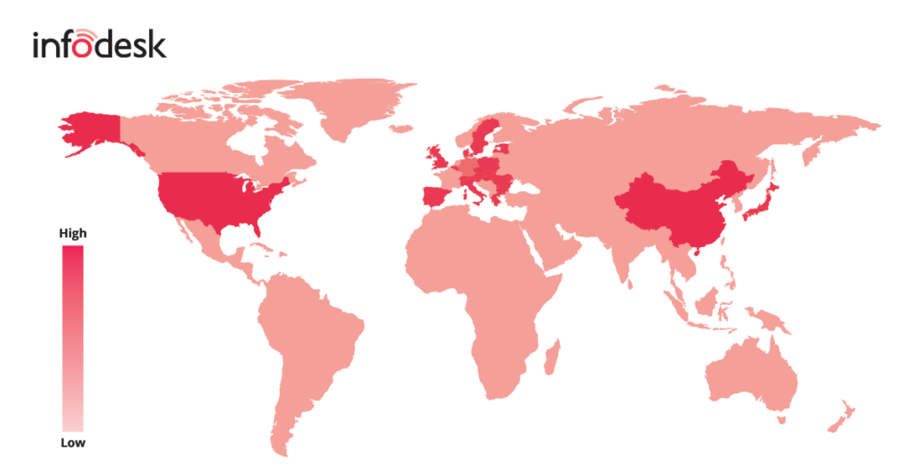
Maps and Geographies
Regional information plays a huge role in some datasets. Overlaying this data on geographic maps is the simplest way for users to comprehend and assign meaning to the data.
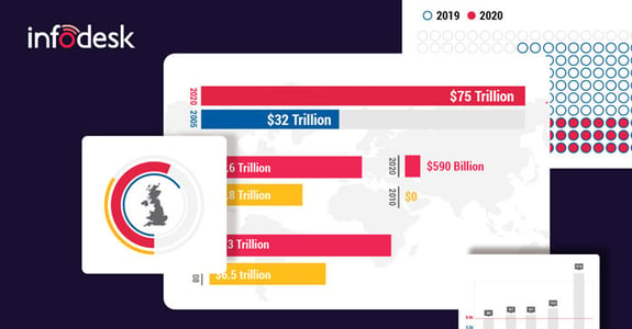
This is a simple example of a combination of geographic maps and datasets.
InfoGraphics
A combination of insights and visualization, infographics take the best of the quantitative and the qualitative. Usually, a combination of graphics, charts, maps, and key bullet points to present information in a way that is easily digestible for its intended audience.
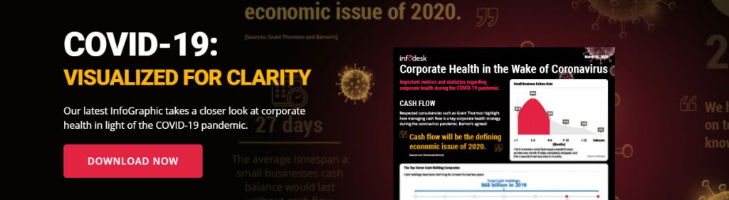
As an example of how these can be used to find clarity in complex datasets, our latest infographic that takes a look at corporate health in light of the COVID-19 pandemic, completely free. Download it here
Conclusion
Data is growing exponentially. The IDC predicts that “The collective sum of the world’s data will grow from 33 zettabytes this year to 175 zettabytes by 2025, for a compounded annual growth rate of 61 percent.”
A zettabyte is one trillion gigabytes. Now multiply that 175 times.
To combat this exponential growth, organizations need solutions that they can use to find meaning out of these datasets. Data visualization is exceptional at doing so, as this blog has highlighted.
If you’d like to learn more about how we use visualization tools for our clients or have any questions about this blog, please get in touch with our team here.
A note from the team
We know that right now organizations are entering unknown and uncomfortable territory and that we need to do our utmost to support them through this trying time. To help, we’ve deployed our experienced editorial team to produce a twice-weekly update on key insights and learnings from the COVID-19 pandemic so that we can all start finding some comfort in information again.
This is available for free to anybody who would like it so if this is something that you would value then please click here and we will include you in the distribution too.
And if you want to talk to the team about your information journey, please don’t hesitate to get in contact.

COMMENTS